Design component libraries and tools for building AI software interfaces with react.
Best Design Libraries for AI SaaS (2026): 25 picks by @bowerbird, including ObsidianUI, Space UI and BoardUI. Curated on Kyurations.
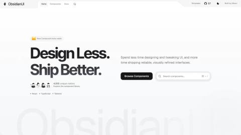
ObsidianUI is a component library for React developers that provides pre-built components, blocks, and landing page templates built with Tailwind CSS. It offers reusable UI elements to accelerate web application and landing page development.
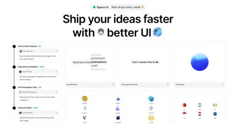
Space UI is a modern component library offering interactive React components, shaders, and tools designed to accelerate product development. The platform targets builders creating high-converting products and integrates with modern AI workflows, enabling developers to quickly turn ideas into polished applications.
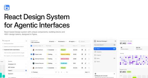
BoardUI is a React design system for building dashboards and agentic products. It includes 85 React components and building blocks, 19 of which are specialized chart cards for data visualization. The system provides 10 Pro templates, uses Tailwind CSS for styling, and offers editable source code for customization.
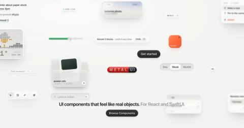
MetalUI is a design system that organizes its elements into distinct layers: parts, components, objects, instruments, and places. This page explains how these layers relate to and build upon each other within the system's structural hierarchy.
Pryzm is a browser-based visual studio for creating original backgrounds and textures using AI-assisted design tools. Users can blend gradients, glass, and grain effects into unique backgrounds and animated loops, remix existing designs from an inspiration gallery, and export as live code (React, Framer, HTML) or video formats. The free tier includes full studio access with watermarked exports at preview size; Pryzm Pro ($9/month) unlocks high-resolution exports up to 4K, watermark-free video, longer loops, and higher frame rates. All rendering happens in-browser with no data leaving the user's device, and exported backgrounds can be used commercially but not resold as stock.
OpenShaders is a platform for publishing and sharing shaders on the web. Users can claim a username before the official launch and receive a custom one-of-a-kind shader generated for their account.
A collection of beautiful, sophisticated UI components built for modern React applications using Tailwind CSS. The library provides pre-built, customizable components designed to streamline development of contemporary web interfaces.
Cuelume is a lightweight, dependency-free JavaScript library that provides pre-designed interaction sounds for web applications. The sounds are synthesized in real-time using the Web Audio API, allowing developers to add polished audio feedback to user interactions without relying on external audio files or dependencies. The library is designed to be minimal and easy to integrate into web projects.
A GitHub repository containing an agent skill designed to improve the feel and user experience of interfaces. The repository appears to be a reusable tool or pattern for developers and designers working with AI agents to enhance interface quality and responsiveness.
Quikspace offers a collection of free, browser-based design tools requiring no login or account creation. The platform enables users to generate logos, invoices, resumes, and other common design assets directly in the browser, making it accessible for both designers and developers who need quick design solutions without technical overhead or cost.
MetalForge is a tool for generating Metal shaders for SwiftUI through an interactive slider-based interface. Users can create real .metal files without writing Metal Shading Language code directly, making shader development more accessible to SwiftUI developers.
beUI provides free, open-source animated components designed for React and Next.js applications. The components are built using Motion (a React animation library) and Tailwind CSS for styling. Developers can either copy the source code directly or install components using the shadcn CLI, making integration into existing projects straightforward.
Drawably is a library that renders hand-drawn UI controls, with each component rendered as a fresh pen sketch. It has zero dependencies, making it lightweight and easy to integrate into projects. The tool allows developers to add a sketchy, informal aesthetic to web interfaces, suitable for applications that benefit from a casual or artistic visual style.
A collection of beautiful, accessible, and high-performance React components built with Tailwind CSS that developers can copy and paste to rapidly build premium interfaces.
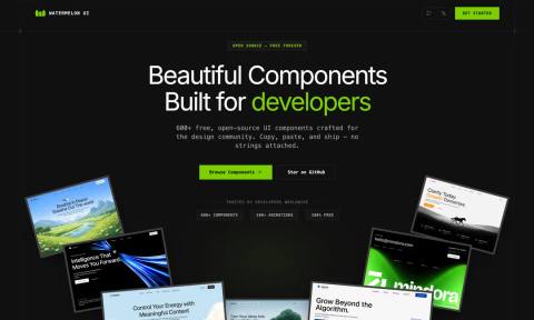
Watermelon UI is a collection of production-ready React components, dashboards, and UI blocks designed for developers to quickly integrate into projects. The library offers high-quality, copy-and-paste ready components that streamline UI development and reduce the need to build from scratch.
UI Skills is a curated collection of design-engineering competencies spanning accessibility, motion design, frontend craft, and interface quality. The resource appears to be aimed at professionals seeking to bridge design and engineering disciplines by building skills in creating thoughtful, accessible, and well-crafted user interfaces.
Rare UI is a free, open-source collection of animated React components built with Tailwind CSS and Motion. Users can copy and paste components directly into their projects and own the code outright, making it a practical resource for developers looking to add polished animated UI elements without external dependencies or licensing restrictions.
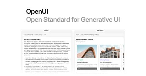
OpenUI is a full-stack, renderer-agnostic standard for generative UI that uses a streaming-first language and official React support. It reduces token usage by up to 67% compared to JSON-based approaches and includes community integrations for broader adoption.
A collection of pre-built, copy-paste UI components designed specifically for AI agent conversations. The library includes components for thinking states, tool calls, streaming text, citations, and tables. AICSS ships in React, Vue, and Svelte with plain CSS styling and no Tailwind dependency, making it framework-flexible and easy to integrate into AI agent applications.
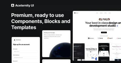
Aceternity UI is a production-ready React component library containing 200+ copy-paste components, blocks, and landing page templates built with Tailwind CSS and Motion. The library is designed to accelerate website development by eliminating time spent on animations and custom styling, allowing developers to build professional landing pages and web applications in hours rather than days. It offers a free tier of components alongside an All-Access Pass for premium templates and blocks, with use cases spanning design studio portfolios, productized agencies, and SaaS startups. The library is trusted by 120,000+ developers and creators and has been featured by popular tech YouTubers demonstrating practical implementations.
assistant-ui is an open-source React library that provides production-ready components and runtimes for building ChatGPT-style chat interfaces, copilots, and AI agents in TypeScript. It includes instant chat UI with theming, state management for streaming conversations with interruptions and retries, and high-performance optimized rendering. The library works with any LLM provider including OpenAI, Anthropic, Google, and others, and integrates with frameworks like Vercel AI SDK, LangChain, and LangGraph. It simplifies the UI development burden so teams can focus on agent logic rather than building chat interfaces from scratch.
Glin UI is a production-ready React component library featuring 76+ glass-morphism components built on Radix UI and Tailwind CSS. The library includes 7 surface variants (glass, liquid, matte, glow, outline, ghost, default), 5 elevation levels with tokenized design tokens, full dark mode support, and accessibility features including WCAG AA contrast, keyboard navigation, and reduced-motion fallbacks. Components are tree-shakeable, type-safe, and distributed across four npm packages: @glinui/ui (components), @glinui/tokens (design tokens), @glinui/motion (animation presets), and @glinui/registry (metadata layer). The project is MIT-licensed and open source, designed to provide visual consistency across marketing and product interfaces with zero runtime CSS-in-JS overhead.
A gallery of real websites, portfolios, and products built using Once UI, a design system or framework. Examples include projects from indie creators like IQON and OsmyReal, as well as work from design agencies, demonstrating the range of applications and outcomes possible with this tool.
An open-source component library providing creative HTML-in-canvas and WebGL effects for popular JavaScript frameworks including React, Solid, Preact, Vue, and Svelte, as well as vanilla JavaScript. The library enables developers to render live HTML content with advanced visual effects through canvas and WebGL technologies.
Opensource UI is a free, MIT-licensed component library offering 100+ production-ready React and Next.js components built with TypeScript and Tailwind CSS v4. Developers can browse live previews and copy source code directly from the website, making it useful for rapidly prototyping interfaces or bootstrapping new projects with pre-built, accessible components.